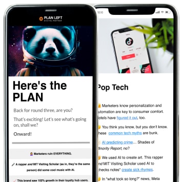
The whole point of your blog is to educate your buyers and solve their pain points, right? Well, of course you also want the benefit of the good SEO you get when publishing fresh content. What are you supposed to do with all those readers who stop by each day? If only there were some way to capture the names of your visitors so you could follow up later.
Oh, look at that! There is a way. There are several ways, actually. Here are just a few of the easier things you can do to turn your blog into a lead generation machine.
Add an Opt-In Form
An opt-in form is one of the easiest microconversions on your website. This lets you know immediately that your visitors are interested in what you have to say. The forms on your page can lead to several different types of content, including a newsletter, ebooks, and white papers. Each form should be clearly labeled. Those who sign up for more than one show a higher-than-average interest in your product.
Consider adding these forms to several different pages on your website, and also place them in various spots. Studies show most readers scan websites in an “F” pattern, meaning they read the headline, the sub-headings, and a few lines of the first paragraphs. If they’re interested enough to continue, then they’ll engage with all the text on the page. You can take advantage of this knowledge by placing your opt-in form in their direct path on the left side of the page.
Make the Value Proposition Clear
Why should your blog visitors sign up to receive more information from you anyway? You can place opt-in forms everywhere and never see a single name if you haven’t made your value proposition abundantly clear. What can you do for those buyers that no one else can? Undrestanding your value proposition is a large part of developing and conveying your brand message. If you’re not sure what makes your company unique, consider revisiting your brand standards or contact us for a branding consultation.
Visitors know that they’ll receive emails from you on a regular basis the moment they turn over their contact information. If you can’t convince them your content is worth signing up for, then you’ll lose the battle before you’ve even begun.
Give Content Away for Free
Who can afford to give away free stuff? You can, if you get some qualified leads out of the deal. Make sure the content you’re offering is of good quality, answers questions your buyer personas always ask, and provides information that can’t be found anywhere else. That’s the magic formula.
Believe it or not, people will give away their contact information in exchange for that content. Then you’ll have a way to reach out later. If you offer content that falls toward the middle of the marketing funnel—you know, that content for people who’ve engaged with your brand more than once or twice—then you can require more information. Over time, you can determine who’s reading, who’s making the decisions, and who’s actually buying.
Work Hard on that CTA
The very purpose of a call-to-action is telling your customers what you want them to do. The problem is, you need to make that CTA stand out while also convincing the customer that clicking the button is their own idea. Your designer may need to help you with this one a little. Your first instinct will probably be to blend those colors into your overall theme. The problem is, if that submit button blends into the rest of the page, your buyers will look right over it.
The words you use on your call-to-action are important, too. I may have called it a “submit” button above, but buyers don’t really like that word. Do some research to see which words buyers do like and react to. “Go” often works well. “Free” is another word that grabs attention.
Consider a Pop-Up
A pop-up window may send you into a wild rage, but not everyone reacts that way. In fact, studies show a pop-up window doesn’t affect the bounce rate at all, but it will boost subscriptions.
If you’re still loath to use them, consider timing the pop-up so that it appears after the reader has finished. That way, you can be sure that potential buyer at least gets all the information on that page before jumping ship. And if they do agree to fill out the contact form as a result of the pop-up, then it’s a win/win for all involved.
If you need any help putting these into practice, we’re always here. Whether design, development, or even content is what you’re looking for, we’ve got you covered. You’ll start raking in the leads in no time.
This article first appeared in February of 2015. It has been updated to exclude a broken link and include a new one.
Explore Latest Posts
Since the last round of Core and Spam updates knocked nearly 40% of websites out of Google’s search index, it ... read more
April 26, 2024
Google says the quality of your webpage is a ranking factor, but what is ‘quality’ according to Google? That would ... read more
April 19, 2024
In 2011, Google first changed how content was written with the Panda Update by changing how keywords could be used ... read more
April 17, 2024
MARKETING insights
Join the Thousands Who Receive Our Twice-Monthly Newsletter.
It's hard to keep up. Our newsletter is packed with buyer behavior insights, the latest marketing and technology updates, work/life balance tips, and—because we ❤️ our support staff—adorable pets looking for forever homes. Only twice per month. No clogged inboxes. You can't say no.
