With billions of dollars spent on online purchases each year, a functioning ecommerce page just isn’t enough anymore. Buyers have needs and demands, and if your website doesn’t meet either, they’ll go somewhere else. But don’t worry! We’re here to walk you through every component you’ll need for a truly stellar ecommerce page, starting with the first thing buyers see: the home page.
While you definitely want your website to stand out from the crowd, there are still a few things that every ecommerce site needs. Ready for a tour?
Store Name
This might seem like a no-brainer, but you’d be surprised how many online stores out there don’t identify themselves right away. Whether using design elements that shove the name of the store out of the way or simply assuming people will know where they are once they land on the page, some ecommerce sites really just don’t get it.
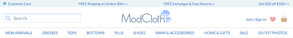
Buyers can become confused and mistrustful very quickly. Anyone who finds your site should know exactly where they are and who you are.
Value Proposition
Once buyers know where they are and who you are, they’ll want to know what you do. What makes your ecommerce company different from every other online store out there? Why are your products better? How is your brand a step above every other? Take a look at how BeeAttitudes.net shares their value proposition right under the page menu.
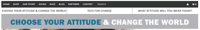
Whether you share this unique value proposition with a tagline, clever copy, or bold images, the important thing is simply that you do share it. Tell those buyers why they want to buy from you.
Easy Navigation
What good is an ecommerce site if your customers don’t know how to find anything? Menu systems usually need to be pretty robust, depending on the size of your inventory and the customization you offer. Make sure everything is clearly labeled and that every page can be reached by links from the home page.
This doesn’t mean you can’t be creative with your menus and filtering systems. Great design always keeps the user’s needs first. The goal is always to get buyers exactly where they need to be so they can make a purchase. If it’s too hard, they’ll go somewhere else.
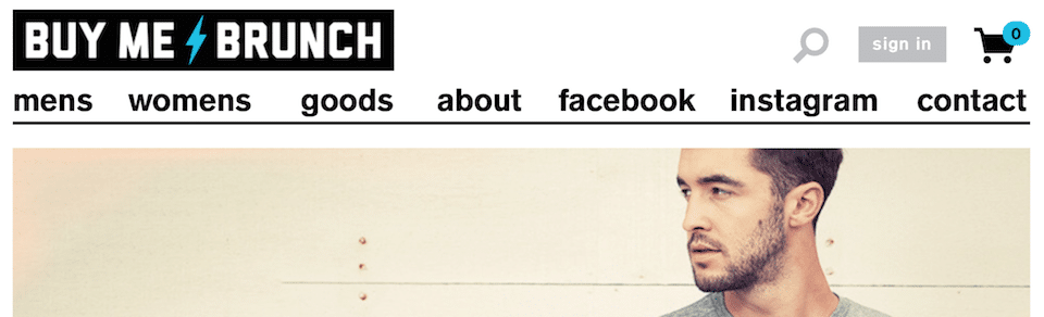
Shopping Cart
Buyers should be able to access their shopping cart no matter where they are in your website. If they’re on the homepage, flipping through T-shirts designs, or reading one of your blogs, one click should be all they need to get to that shopping cart. Each of the examples above shows how easy getting to the shopping cart is, with little icons in the top right corners.
That opportunity to complete a purchase should always be available. You’re already fighting some pretty sobering statistics—like 99% of online shoppers have no intention of buying during their first visit anyway. Why would you make things harder on yourself?
Security Seals
No matter how popular ecommerce gets, some will always be nervous about sharing their financial and personal information on the internet. In fact, 20% of consumers still won’t buy online. It’s your job to let each and every consumer who visits your page know they’re safe.
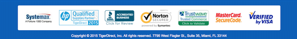
Apply for security seals from VeriSign, GeoTrust, or Thawte. These are some of the most trusted names in internet security. You can receive authentication and 256-bit encryption, which strong enough to give your buyers peace of mind.
With these five things on your ecommerce homepage, you’ll be ready to delight your buyers at all times. What happens after they leave your homepage, however, is another story—one we’ll cover in a series of ecommerce web development blogs. When we’re done, you’ll have a super-strong ecommerce site that does exactly what you need it to do: convert customers.
If you need to talk to someone about increasing your ecommerce site’s effectiveness, we’re always here. Whether you just need a boost to your current site or want something built from the ground up, we can help.
Explore Latest Posts

Google says the quality of your webpage is a ranking factor, but what is ‘quality’ according to Google? That would ... read more
April 19, 2024
In 2011, Google first changed how content was written with the Panda Update by changing how keywords could be used ... read more
April 17, 2024
The latest Google algorithm changes have shaken the search marketing world. While the Google Spam update has finished, the Google ... read more
April 16, 2024
MARKETING insights
Join the Thousands Who Receive Our Twice-Monthly Newsletter.
It's hard to keep up. Our newsletter is packed with buyer behavior insights, the latest marketing and technology updates, work/life balance tips, and—because we ❤️ our support staff—adorable pets looking for forever homes. Only twice per month. No clogged inboxes. You can't say no.