
In ADA-compliant website design, the treatment of navigation menus, including mega menus, in terms of clickability is a vital aspect. The primary goal is to make sure these menus are accessible and usable for all users, including those with disabilities.
Clickable Elements in ADA-Compliant Navigation & Mega Menus
Navigation elements compliance with the Americans with Disabilities Act (ADA) standards is important, particularly in complex structures like mega menus, and also, it’s the law. This encompasses a range of aspects, from the functionality and clarity of clickable items to the accessibility of non-interactive elements. Ensuring that these elements are designed and coded with accessibility in mind not only enhances usability for individuals with disabilities but also improves the overall user experience.
Clickable vs. Non-Clickable Items
- Clickable Items: These are typically links or buttons that lead to another page, anchor a section within the same page, or trigger a function (like opening a submenu). These items must be clearly identified and interactable for ADA compliance using various input methods (mouse, keyboard, touch, voice commands).
- Non-Clickable Items: Sometimes used as headings or labels to categorize menu items. They are not meant to be interactive but should still be accessible to screen readers for context.
Accessibility Features for Clickable Items
- Keyboard Navigation: Users should be able to navigate through all clickable items using keyboard controls (e.g., Tab and arrow keys).
- Keyboard Navigation Basics for Websites
- Tab: Moves focus forward to the next interactive element (like links, buttons, form fields).
- Shift + Tab: Moves focus backward to the previous interactive element.
- Return/Enter: Activates focused elements such as links, buttons, and form submissions.
- Spacebar: Typically activates focused buttons, toggles checkboxes, or starts/stops media like videos. In some contexts, it may also be used for page scrolling.
- Esc (Escape): Closes or exits modal windows, dropdown menus, and other pop-up content; cancels ongoing actions if applicable.
- Arrow Keys
- Up/Down Arrows: Navigate within drop-down menus, increment/decrement values in number inputs, and scroll vertically through page content or widgets.
- Left/Right Arrows: Navigate between items in horizontal menus or tab lists, adjust sliders, and scroll horizontally on pages or within widgets.
- Home/End
- Home Key or Fn + Left Arrow Key: Jumps to the top of a page or to the beginning of a list or group of interactive elements.
- End Key or Fn + Right Arrow Key: Moves to the bottom of a page or to the end of a list or group of interactive elements.
- Page Up/Page Down
- Page Up or Fn + Up Arrow Key: Scrolls up through page content, moving a significant amount at a time (usually one screen’s worth).
- Page Down or Fn + Down Arrow Key: Scrolls down through page content in similar large increments.
- F (Function) Keys
- Often used for specific browser functions, for example, F5 typically refreshes the page.
- Their use can vary in web applications and should be documented if they provide unique functionality.
- Alt + Left/Right Arrow: Navigates backward or forward through the browser’s history (similar to the back and forward buttons in a browser).
- Ctrl + F: Opens the browser’s search function to find specific text on the current page.
- Focus Indicators: A visible indication (like an outline) should be visible when a clickable item is focused.
- Screen Reader Friendly: Use ARIA labels and roles so that screen readers are able to accurately interpret and read out the menu items and their functions.
- Clear Labeling: Each clickable item should have a descriptive label indicating its function or destination.
- Keyboard Navigation Basics for Websites
Mega Menus
- Expand/Collapse Functionality: If your mega menu expands to reveal sub-items, this action should be easily operable through mouse clicks and keyboard inputs. The state (expanded or collapsed) should be clear.
- Large Dropdowns: Make sure that dropdowns do not block other interactive elements and can be easily navigated. Consider how these menus will operate for touchscreen users and in mobile views.
- Organization: Group items logically and use headings (non-clickable items) within the mega menu for clarity.
- Responsive Design: Check that navigation, including mega menus, is fully functional and accessible on different devices and screen sizes.

It’s the How That Matters
For ADA compliance, it’s not just about whether items are clickable or not but how these clickable items are presented and interacted with. The key is to make the navigation experience intuitive, predictable, and accessible for all users.
By focusing on these three key aspects, you create a user-friendly navigation experience for a diverse range of visitors, including those with disabilities. This not only improves overall usability but also confirms compliance with essential web accessibility standards.
Intuitive Navigation
Intuitive navigation means that users understand and use the navigation system without needing explicit instruction. It should feel natural and easy to use.
Examples
 Familiar Layouts: Using common patterns for menu placement, like horizontal menus at the top or vertical menus on the left side.
- Descriptive Labels: Menu items are clearly labeled with words that accurately describe the content or destination (e.g., “Contact Us,” “Services,” “Blog”).
- Consistent Design: Using the same style, color, and typography for similar types of links or buttons throughout the site.
 Familiar Layouts: Using common patterns for menu placement, like horizontal menus at the top or vertical menus on the left side.
Predictable Navigation
Predictable navigation means that the navigation works in a way that users can anticipate based on their previous experience with similar interfaces. It avoids surprises or the need for trial and error.
Examples
- Consistent Functionality: If clicking on one menu item expands a dropdown, users expect similar items to behave the same way.
- Standard Icons: Using universally recognized icons (like a magnifying glass for search).
- Sequential Order: Tab order and navigation flow logically from left to right and top to bottom.
Accessible Navigation
Accessible navigation makes sure that all users, including those with disabilities, can effectively navigate the website. It complies with ADA and WCAG guidelines.
Examples
- Keyboard Navigation: All navigation elements are operable with keyboard controls.
- Screen Reader Compatibility: Using proper HTML and ARIA roles so that screen readers can accurately interpret and convey information about navigation elements.
- Example of aria-label:
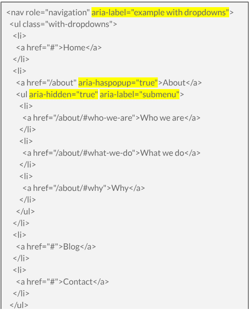
-
- On the PLALEF website:
-
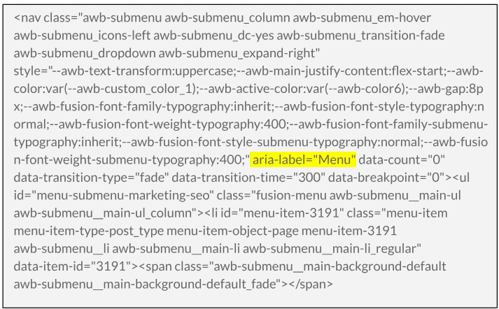
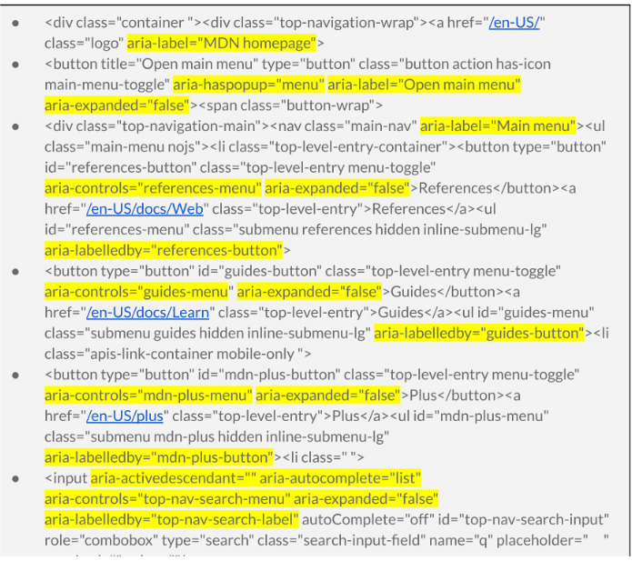
- Example from MDN Web Doc, Resources for Developers, by Developers
This is not the full code from the website but snippets where ‘aria’ is used. For the full example, please see the bottom of this content page or visit the ‘view page source’ of the website by right-clicking on the webpage and selecting ‘view page source.’
- Example from MDN Web Doc, Resources for Developers, by Developers
-
- Visible Focus Indicators: When users navigate using a keyboard, there’s a clear focus indicator on the selected element.
- Alternative Text for Images: Providing alt text for images used in the navigation, like logos or icons.
- Responsive Design: Navigation remains functional and accessible on various devices and screen sizes.
ARIA – Designed to Enhance Accessibility
ARIA attributes are part of making web content more accessible to users with disabilities. It’s important to use them correctly and in conjunction with semantic HTML for the best experience for all users. Remember, ARIA attributes do not replace good, semantic HTML but rather supplement it where HTML falls short.
Commonly seen ARIA attributes with examples:
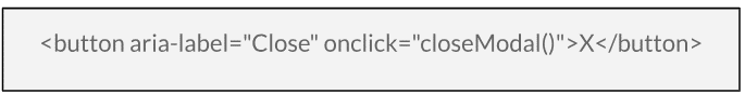
aria-label
- What it does: Provides a text label for an element, especially useful for elements that do not have visible text.
- When to use it: Use it when an element needs a descriptive label for assistive technologies, like icons or buttons with no text.
- Example: Used here to provide a label for a button that only contains an “X” symbol, indicating its function to close a modal.
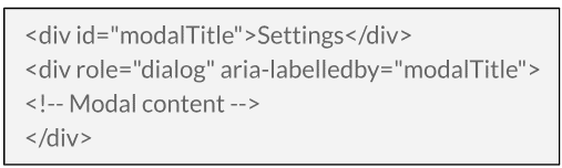
aria-labelledby
- What it does: References other elements to define a label. It allows for more complex labels that combine text from multiple elements.
- When to use it: Use it when a label consists of multiple separate elements, like a header and a subtitle.
- Example: The modal dialog is labeled by the text inside the ‘modalTitle’ element.
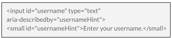
aria-describedby
- What it does: References other elements to provide a description. It’s used to offer additional information about an element.
- When to use it: Use it to describe complex controls or provide additional context that is not clear from the label alone.
- Example: The input field is described by additional text, providing more context to the user.
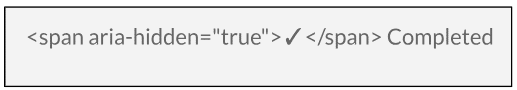
aria-hidden
- What it does: Indicates whether an element is visible to screen readers.
- When to use it: Use it to hide decorative content or elements that are not relevant to screen reader users.
- Example: The checkmark icon is hidden from screen readers, as it’s purely decorative.
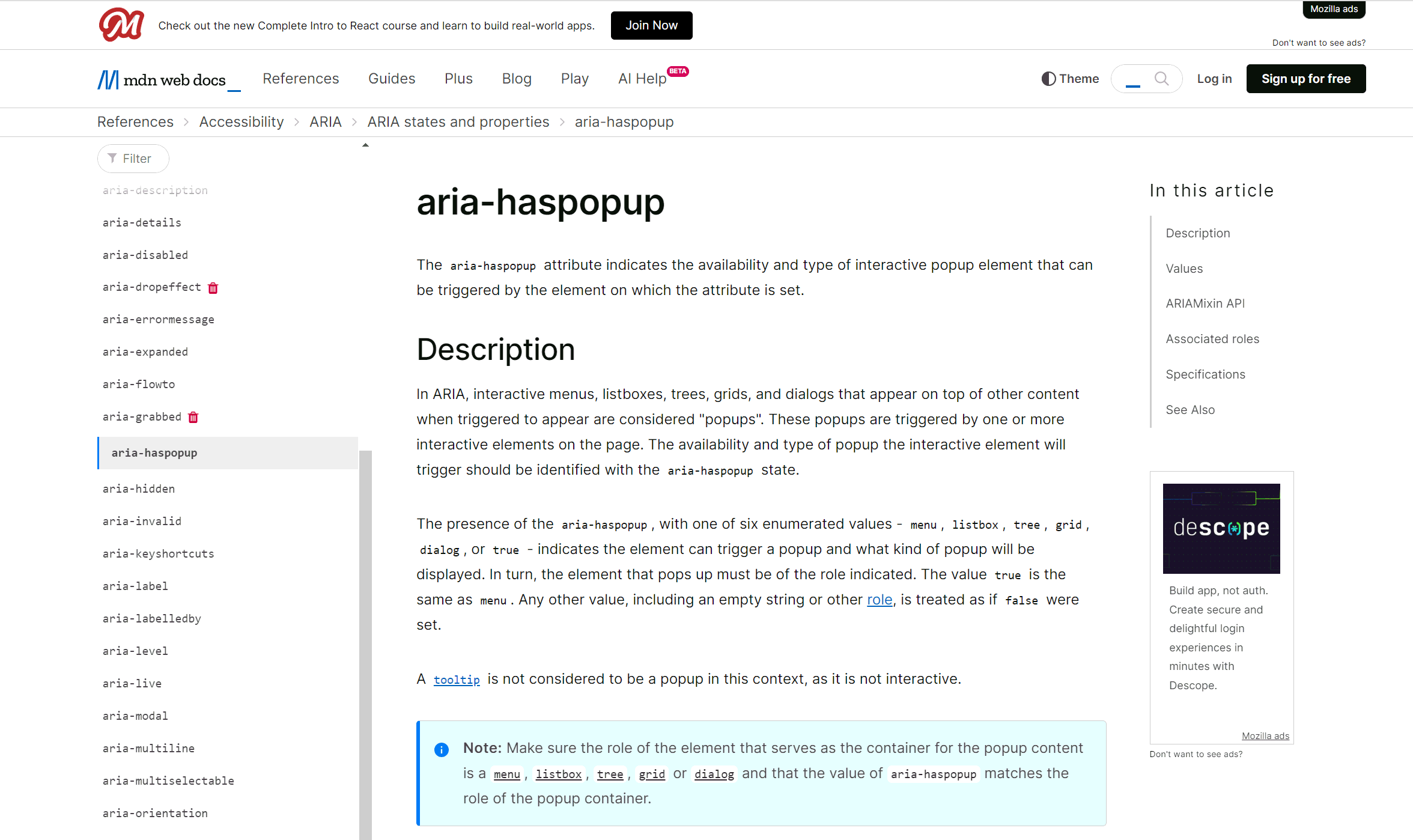
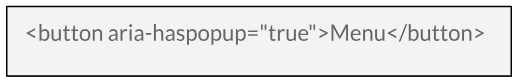
aria-haspopup
- What it does: Indicates that an element triggers a popup, such as a menu or dialog.
- When to use it: Use it for elements that control popups, like dropdown menus or modal dialog triggers.
- Example: Indicates that activating the button will display a popup menu.
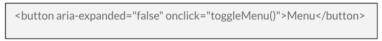
aria-expanded
- What it does: Indicates whether a collapsible element is currently expanded or collapsed.
- When to use it: Use it for elements like dropdown menus, accordion sections, or collapsible panels.
- Example: Indicates that the menu is currently collapsed; the value should change to “true” when the menu is expanded.
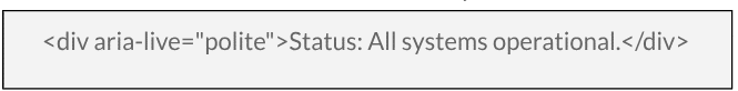
aria-live
- What it does: Indicates that an element will update dynamically. It’s used for content that changes over time, like a news ticker.
- When to use it: Use it for dynamic content updates that should be announced by screen readers.
- Example: Used for a status message that updates dynamically. “Polite” means updates will be announced when the user is not busy with other tasks.
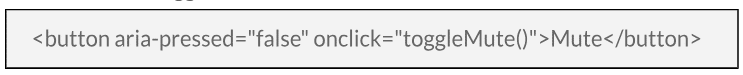
aria-pressed
- What it does: Indicates the current “pressed” state of toggle buttons.
- When to use it: Use it for buttons that can be toggled on or off, like a mute button.
- Example: Indicates the toggle state of a button, similar to a checkbox.
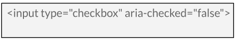
aria-checked
- What it does: Indicates the checked state of checkboxes, radio buttons, and similar widgets.
- When to use it: Use it for elements where a checked or unchecked state needs to be communicated.
- Example: Indicates whether a checkbox is checked. This is usually redundant with native HTML checkboxes but is useful for custom-styled checkboxes.
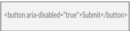
aria-disabled
- What it does: Indicates that an element is currently disabled.
- When to use it: Use it for interactive elements like buttons or links that are currently inactive.
- Example: This attribute is useful for elements that are visually styled as disabled but may not be disabled in the HTML sense. For instance, a button that looks disabled but is still focusable for accessibility reasons.
aria-role
- What it does: Defines the role of an element, providing context about how it should be interpreted or interacted with.
- When to use it: Use it to define the role of elements, especially when the semantic HTML element does not convey the role itself.
- Example: Indicates that the button is disabled and not interactive.
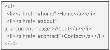
aria-current
- What it does: Indicates the current item within a set of items.
- When to use it: Use it in navigation menus to indicate the currently active item or in a list of search results to highlight the current selection.
- Example: Indicates that the “About” link is the current page in the navigation menu.
What’s the Outcome
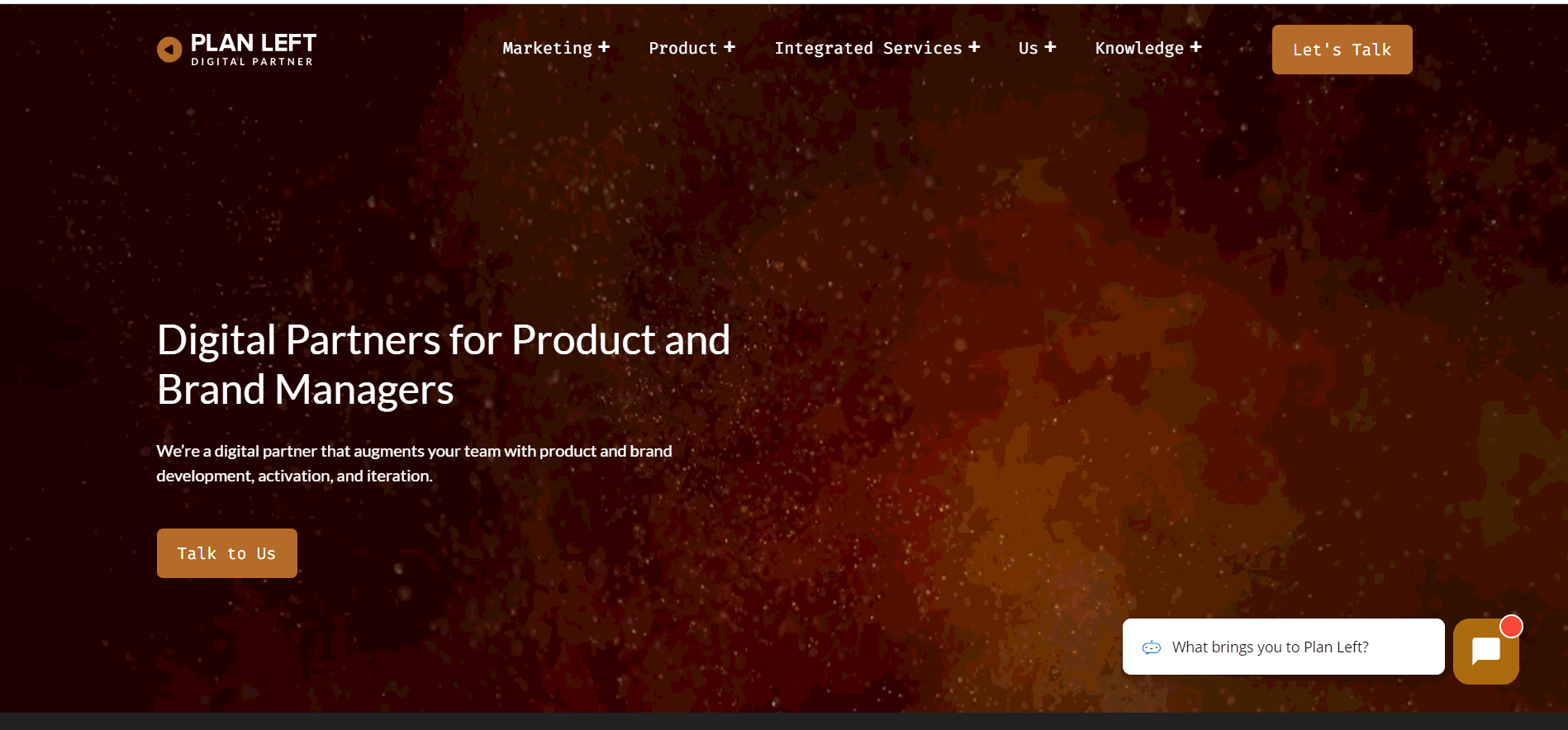
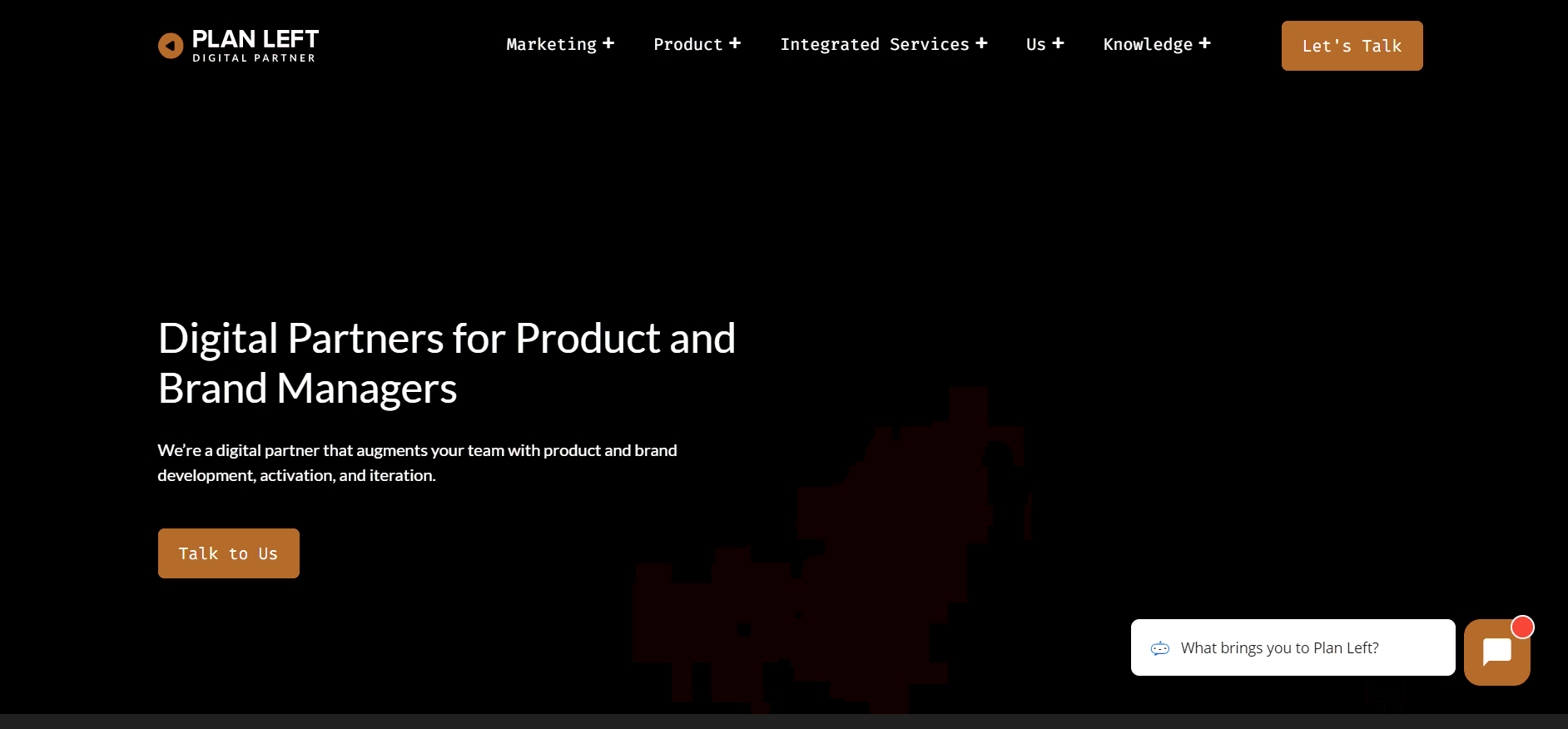
If you run an accessibility scan using a tool like Pagespeed, Plan Left comes through hitting all of the basic website accessibility markers for its mega menu.
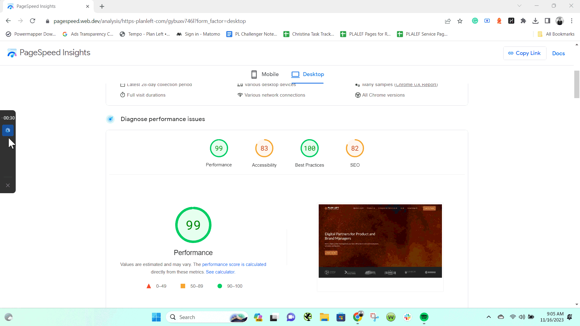
However, if we approach the mega menu from a user’s perspective, it doesn’t come through as strong.
Clickable vs. Nonclickable: There is nothing visually differentiating what is a clickable element from what is a nonclickable element. This challenges website users from finding the path to the source of information they are looking for. Additionally, this decreases click-through rate and increases bounce rate. Additionally, the sub-menu items do not clearly show when hovered over. There should be a clear indication when a sub-menu item is being selected. For example, use color modifiers or underline the text of clickable elements when hovered over, leaving nonclickable elements in a static state.
To answer the question of, “Should the menu items all have links?” the answer is no. But, there should be a differentiator between what is clickable and what is not. Not only should the clarifier be visual, but also identified with ARIA attributes for users using alternative means of website exploration.
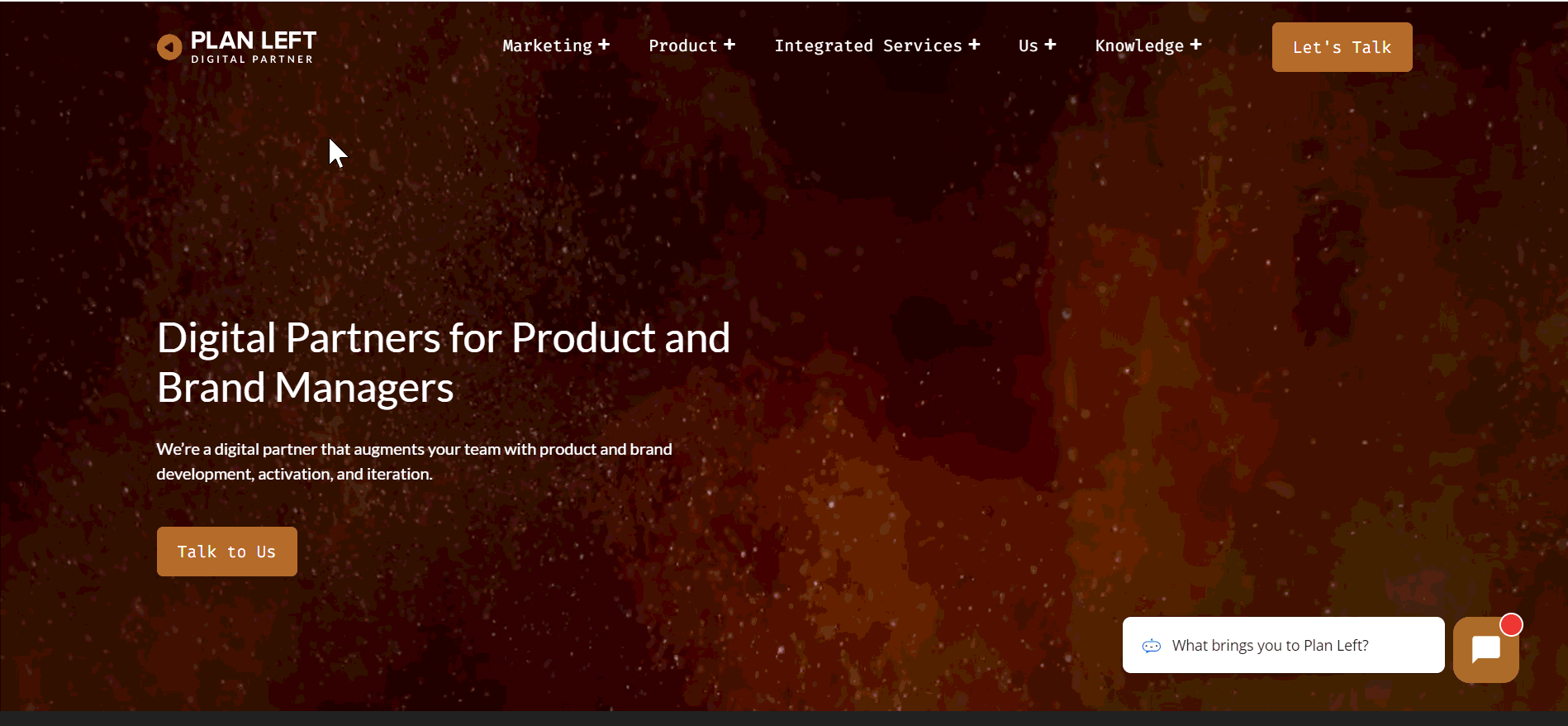
Now, let’s look at the three key elements for Plan Left:
- Intuitive navigation
The question is, “Is the Plan Left menu easy to understand and simple to navigate?”- Familiar Layouts: Yes, the layout of the menu is familiar and simple to follow.
- Descriptive Labels: Yes, the labels are clear and easy to understand the intent.
- Consistent Design: Yes, the design is consistent throughout the menu.
- Predictable Navigation
Here, we are asking, “Is the navigation process easy for the user?”- Consistent Functionality: Yes, the navigation is consistent in its behavior and function.
- Standard Icons: Yes, icons are easily recognizable.
- Sequential Order: Yes, the menu flows in an easy to follow order.
- Accessible Navigation
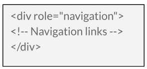
Is navigating the menu accessible to all users, regardless of ability?- Keyboard Functions For User Website Exploration: No, the Plan Left menu does not offer an easy keyboard navigation experience. To enable keyboard navigation on the Plan Left website, there should be an addition to the HTML that includes ARIA attributes as well as landmarks. This helps the navigation process of not only screenreaders but keyboard navigation as well.
An example of a landmark to consider would be:

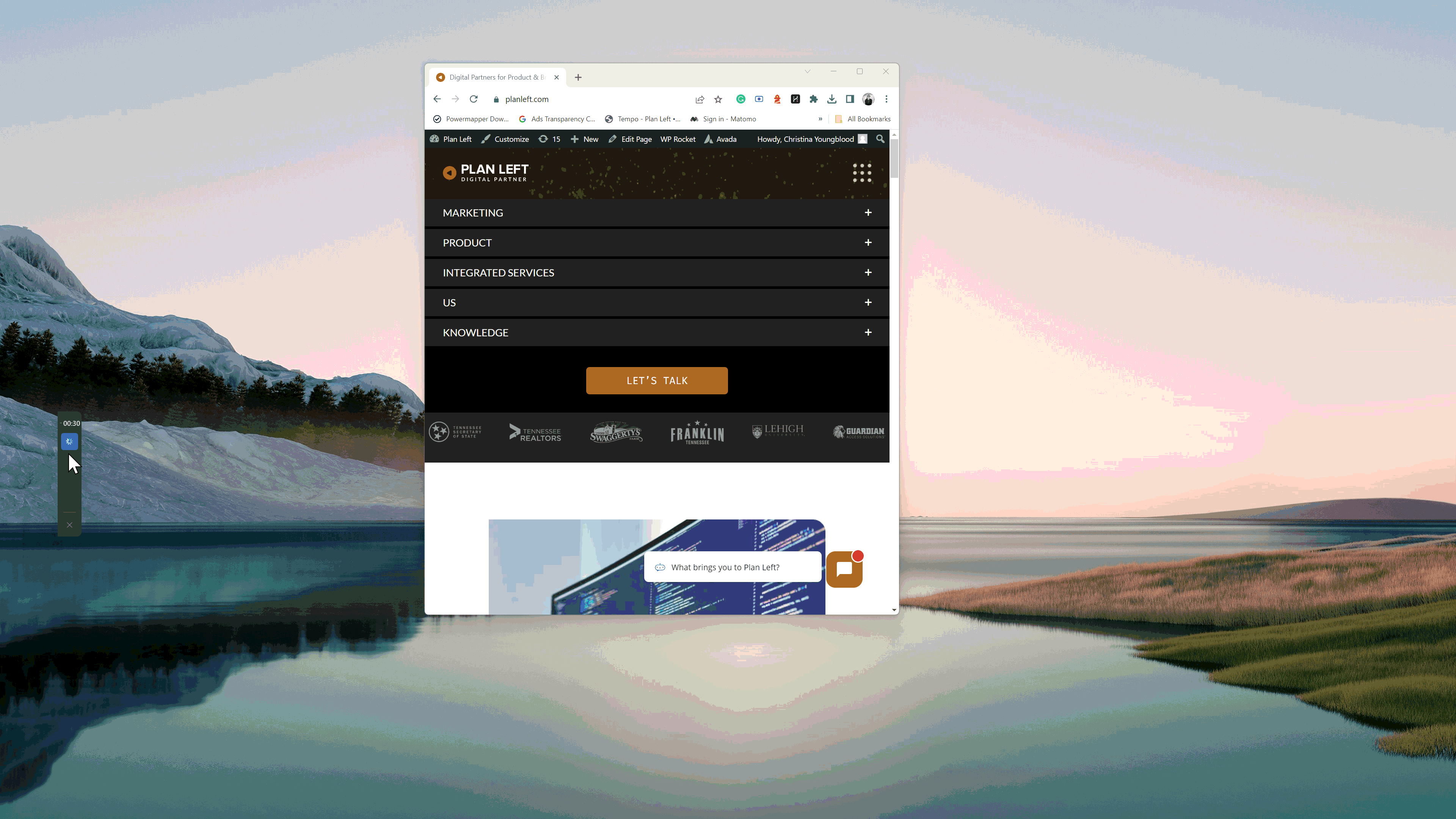
To add, the mega menu currently blocks other interactive elements on the website when it opens up from the main navigation menu to show the sub-menu items. This prohibits the blocked interactive elements from being accessed through keyboard exploration, and it also negatively affects the user experience by preventing the user from interacting with the interactive element as well because they cannot see it.
- Screen Reader Compatibility: No, not all ARIA attributes are used to create an easy user experience for those using alternative website browsing tools. Consider incorporating ‘aria-haspopup’ to improve the navigation experience for all users.
- Visible Focus Indicators: This is a yes but no. In order to select the menu, the user must first click on the top of the webpage to select the menu area. Otherwise, the user is taken to elements elsewhere on the webpage. What is also not encouraging is that the Plan Left logo at the top left corner before the menu does not show as a selected element, but it is part of the keyboard navigation, requiring the user to hit ‘tab’ twice to find their place on the webpage.

For improvement recommendations, see the section above regarding Keyboard Navigation.
- Alternative Text for Images: Yes, but no. The alt text provided for the images does not convey the purpose of the images and their use. For example, let’s look at the ‘Knowledge’ image.

- Alternative Text for Images: Yes, but no. The alt text provided for the images does not convey the purpose of the images and their use. For example, let’s look at the ‘Knowledge’ image.
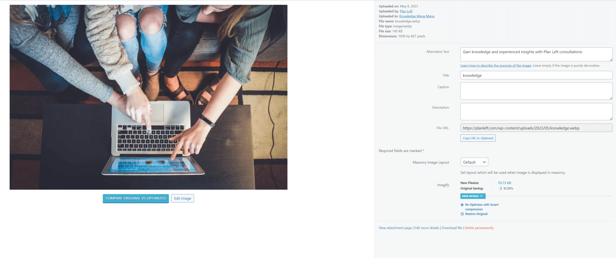
The alt text reads as a CTA rather than for user understanding: Gain knowledge and experience insights with Plan Left consultations.
An alt texts purpose is twofold: to share with the user what the image is and to help search engine crawlers understand the purpose of the image and how it relates to the content it’s being presented with.
An improvement opportunity could look something like: Three individuals sit in front of a laptop, looking to gain knowledge and insights with Plan Left.
The title is okay as it stands but the ultimate goal should be to title the images as they relate to the content. An alternative would be, “Scrolling Knowledge Menu.”
Captions should not be used or shown unless they are for audio purposes. The images are showing the image title as a caption – this feature should be turned off. It adds confusion to the user journey, especially for those looking for captions where audio is present.
The description may be a copy and paste of the alt text, but its purpose is to provide a more thorough description of the alt text. The character limit for this should not exceed more than 200-250 characters due to the limits of some screenreaders.
- Responsive Design: No, user navigation changes in mobile view, and the element selection does not remain in place as the user navigates with keyboard exploration.
Remember to test out all changes made to the menu, testing them in various views as well as how all possible users may access the website to determine if additional ARIA attributes or other HTML improvements should be added, such as landmarks.
Our Experience Shared
At Plan Left, we are committed to continuous improvement and innovation. We rigorously evaluate our practices and standards, always seeking ways to enhance them. Our approach begins with introspection — we candidly acknowledge our areas of improvement. This self-awareness is crucial because it guides us in identifying potential growth areas as we work on your website. By learning from our experiences, we empower you to uncover and seize your own growth opportunities. Connect with Plan Left today to explore how we can help you expand and succeed.
Explore Latest Posts

When to Pull the Plug: How to Know If Your Marketing Strategy Isn't Working Marketing strategies require time to mature, ... read more
June 10, 2026
How to Build a Marketing Strategy When You're the Bottleneck in Your Business Marketing plans consistently fail to launch because ... read more
June 3, 2026
Marketing Mistakes That Are Killing Your Margins (And How to Fix Them) Most businesses measure marketing success by growth metrics ... read more
May 27, 2026


Essential Strategies for Entrepreneurs
Get Actionable Business Insights & Marketing Tips
Our newsletter delivers real-world strategies from entrepreneurs who’ve been exactly where you are.
Sign up now for:
- Actionable growth strategies that work
- Insider tactics for attracting top talent
- Real-world case studies from successful founders
- Emerging tech trends that drive innovation
- Pragmatic marketing approaches for visionary leaders