
The principles of accessibility open digital doors to a broader audience and enhance the user experience for everyone. Implementing features like clear labeling, keyboard navigation, and screen reader compatibility adheres to standards while building an inclusive and welcoming digital environment. Plus, it’s the law.
Importance of Keyboard Navigation
Keyboard navigation is a cornerstone of web accessibility. It is vital for users who rely on keyboards due to physical limitations, vision impairments, or a preference for navigation. Understanding and implementing keyboard navigation is not just about compliance with accessibility standards; it’s about creating an inclusive web environment for everyone.
Accessibility Features for Clickable Items
Users should be able to navigate through all clickable items using keyboard controls (e.g., Tab and arrow keys). For those without visual impairments, a visible focus indicator should also be apparent as the user navigates the website.
For basic keyboard navigation, the user should be able to navigate your website easily and efficiently with the following keyboard basics:
- Keyboard Navigation Basics for Websites
- Tab: Moves focus forward to the next interactive element (like links, buttons, form fields).
- Shift + Tab: Moves focus backward to the previous interactive element.
- Return/Enter: Activates focused elements such as links, buttons, and form submissions.
- Spacebar: Typically activates focused buttons, toggles checkboxes, or starts/stops media like videos. In some contexts, it may also be used for page scrolling.
- Esc (Escape): Closes or exits modal windows, dropdown menus, and other pop-up content; cancels ongoing actions if applicable.
- Arrow Keys
- Up/Down Arrows: Navigate within drop-down menus, increment/decrement values in number inputs, and scroll vertically through page content or widgets.
- Left/Right Arrows: Navigate between items in horizontal menus or tab lists, adjust sliders, and scroll horizontally on pages or within widgets.
- Home/End
- Home Key or Fn + Left Arrow Key: Jumps to the top of a page or to the beginning of a list or group of interactive elements.
- End Key or Fn + Right Arrow Key: Moves to the bottom of a page or to the end of a list or group of interactive elements.
- Page Up/Page Down
- Page Up or Fn + Up Arrow Key: Scrolls up through page content, moving a significant amount at a time (usually one screen’s worth).
- Page Down or Fn + Down Arrow Key: Scrolls down through page content in similar large increments.
- F (Function) Keys
- Often used for specific browser functions, for example, F5 typically refreshes the page.
- Their use varies in web applications and should be documented if they provide unique functionality.
- Alt + Left/Right Arrow
- Navigates backward or forward through the browser’s history (similar to the back and forward buttons in a browser).
- Ctrl + F
- Opens the browser’s search function to find specific text on the current page.
Visibility in Interaction
Focus indicators are essential for accessibility, providing a visual cue, such as an outline, when a user focuses on a clickable item using the keyboard. This feature is especially crucial for users who rely on keyboard navigation, as it clearly shows which element is currently selected and ready for interaction. Implementing strong visual focus indicators helps all users, but particularly those with visual or motor impairments, to better navigate and use a website.
We are able to clearly see where the user is navigating from the example below with the focus indicator that is in place on the World Wide Web Consortium (W3C) website:
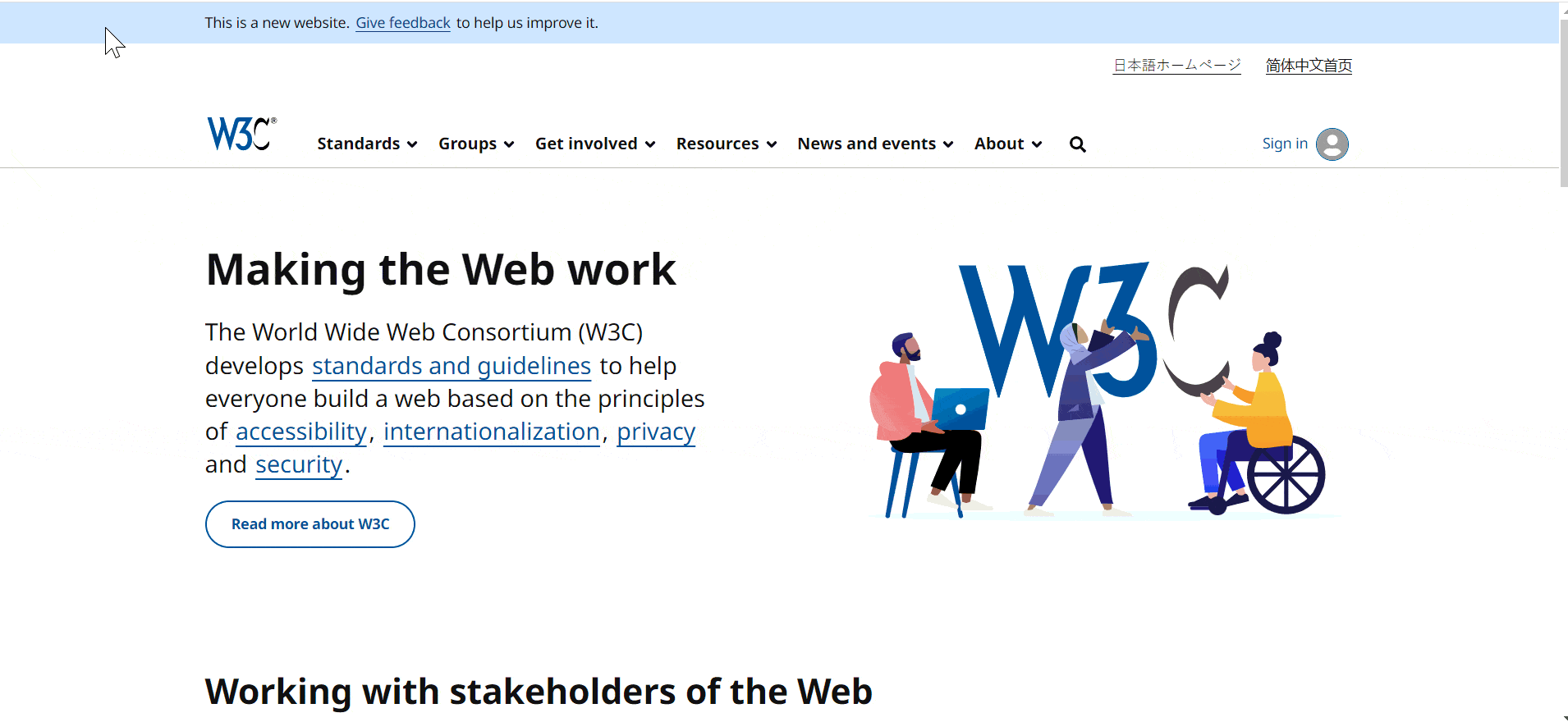
Be mindful of interactive areas that might be obscured by pop-ups or menus during navigation. Such overlays can hinder the user experience by (a) making the focus indicator invisible, and (b) preventing interaction with the underlying elements. It’s important to keep all interactive components accessible and visible throughout the user’s journey to maintain a user-friendly and accessible website.
Screen Reader Friendly
It’s vital to make your website screen reader-friendly for users with visual impairments. This involves using ARIA (Accessible Rich Internet Applications) labels and roles. These features enable screen readers to accurately interpret and announce the purpose and function of menu items and other interactive elements. Proper use of ARIA labels and roles ensures that users relying on screen readers can understand and navigate your website with the same ease as sighted users.
Commonly seen ARIA attributes with examples:
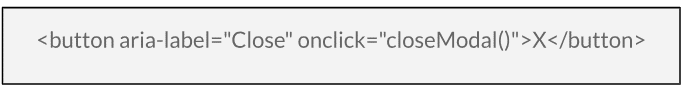
aria-label
- What it does: Provides a text label for an element, especially useful for elements that do not have visible text.
- When to use it: Use it when an element needs a descriptive label for assistive technologies, like icons or buttons with no text.
- Example: Used here to provide a label for a button that only contains an “X” symbol, indicating its function to close a modal.
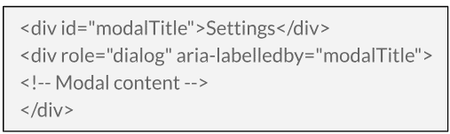
aria-labelledby
- What it does: References other elements to define a label. It allows for more complex labels that combine text from multiple elements.
- When to use it: Use it when a label consists of multiple separate elements, like a header and a subtitle.
- Example: The modal dialog is labeled by the text inside the ‘modalTitle’ element.
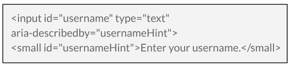
aria-describedby
- What it does: References other elements to provide a description. It’s used to offer additional information about an element.
- When to use it: Use it to describe complex controls or provide additional context that is not clear from the label alone.
- Example: The input field is described by additional text, providing more context to the user.
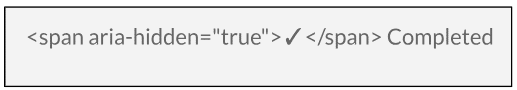
aria-hidden
- What it does: Indicates whether an element is visible to screen readers.
- When to use it: Use it to hide decorative content or elements that are not relevant to screen reader users.
- Example: The checkmark icon is hidden from screen readers, as it’s purely decorative.
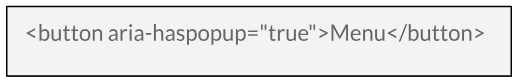
aria-haspopup
- What it does: Indicates that an element triggers a popup, such as a menu or dialog.
- When to use it: Use it for elements that control popups, like dropdown menus or modal dialog triggers.
- Example: Indicates that activating the button will display a popup menu.
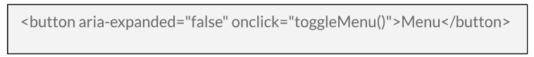
aria-expanded
- What it does: Indicates whether a collapsible element is currently expanded or collapsed.
- When to use it: Use it for elements like dropdown menus, accordion sections, or collapsible panels.
- Example: Indicates that the menu is currently collapsed; the value should change to “true” when the menu is expanded.
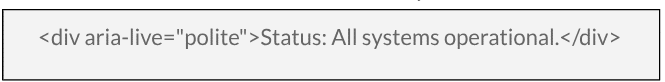
aria-live
- What it does: Indicates that an element will update dynamically. It’s used for content that changes over time, like a news ticker.
- When to use it: Use it for dynamic content updates that should be announced by screen readers.
- Example: Used for a status message that updates dynamically. “Polite” means updates will be announced when the user is not busy with other tasks.
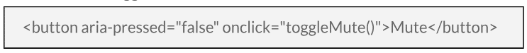
aria-pressed
- What it does: Indicates the current “pressed” state of toggle buttons.
- When to use it: Use it for buttons that can be toggled on or off, like a mute button.
- Example: Indicates the toggle state of a button, similar to a checkbox.
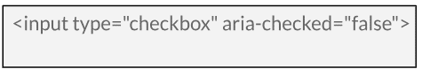
aria-checked
- What it does: Indicates the checked state of checkboxes, radio buttons, and similar widgets.
- When to use it: Use it for elements where a checked or unchecked state needs to be communicated.
- Example: Indicates whether a checkbox is checked. This is usually redundant with native HTML checkboxes but is useful for custom-styled checkboxes.
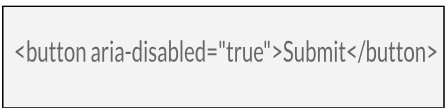
aria-disabled
- What it does: Indicates that an element is currently disabled.
- When to use it: Use it for interactive elements like buttons or links that are currently inactive.
- Example: This attribute is useful for elements that are visually styled as disabled but may not be disabled in the HTML sense. For instance, a button that looks disabled but is still focusable for accessibility reasons.
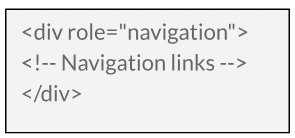
aria-role
- What it does: Defines the role of an element, providing context about how it should be interpreted or interacted with.
- When to use it: Use it to define the role of elements, especially when the semantic HTML element does not convey the role itself.
- Example: Indicates that the button is disabled and not interactive.
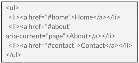
aria-current
- What it does: Indicates the current item within a set of items.
- When to use it: Use it in navigation menus to indicate the currently active item or in a list of search results to highlight the current selection.
- Example: Indicates that the “About” link is the current page in the navigation menu.
Descriptive Labeling
Clear labeling of clickable items is a cornerstone of user-friendly website design. Each interactive element should have a descriptive label that clearly indicates its function or the destination it leads to. For instance, instead of labeling a button simply as “Click Here,” use more descriptive text like “Download PDF Brochure” or “Sign Up for Newsletter.”
This clarity not only benefits users with cognitive impairments but improves the overall user experience by making navigation more intuitive and straightforward. Users should be able to understand the action or destination of a link or button just by reading its label.
Well-labeled elements contribute to a more navigable and accessible website for all users:
- Enhanced User Experience: Users who find a website easy to navigate and understand are more likely to stay on the site longer, reducing the bounce rate. Clear labeling helps users quickly find what they are looking for, improving their overall experience.
- Increased Engagement: Descriptive labels make it clear what action will occur when a link or button is clicked. This clarity encourages users to engage more with the content as they feel more confident about what to expect, potentially increasing the CTR.
- Better Navigation: Clear labeling aids in intuitive navigation, allowing users to move through the site with ease. This leads to more page views per visit and less frustration, again contributing to a lower bounce rate.
- SEO Benefits: Search engines favor websites that provide a good user experience. Clear labeling is a part of this, and it indirectly contributes to better search engine rankings, leading to more traffic and potentially higher CTR.
- Trust and Credibility: When users understand where each link or button will take them, it builds trust and credibility. This trust encourages more clicks and interactions with your site.
- Accessibility Compliance: Adhering to accessibility standards not only helps users with disabilities but also improves the overall structure and readability of the site, which positively influences user behavior metrics like bounce rate and CTR.
Build an Inclusive Digital World While Growing Your Audience
The commitment to accessibility can significantly grow your audience, improve engagement, and foster brand loyalty. Are you ready to transform your website into a more accessible and user-friendly platform?
Reach out to Plan Left today. Our team is dedicated to building digital solutions that apply to all users, making sure your website is compliant and a step ahead of competitors.
Explore Latest Posts

How to Build a Marketing Strategy When You're the Bottleneck in Your Business Marketing plans consistently fail to launch because ... read more
June 3, 2026
Marketing Mistakes That Are Killing Your Margins (And How to Fix Them) Most businesses measure marketing success by growth metrics ... read more
May 27, 2026
Balancing Long-Term Brand Building vs. Immediate Lead Generation Marketing budget discussions frequently devolve into debates between brand building and lead ... read more
May 20, 2026


Essential Strategies for Entrepreneurs
Get Actionable Business Insights & Marketing Tips
Our newsletter delivers real-world strategies from entrepreneurs who’ve been exactly where you are.
Sign up now for:
- Actionable growth strategies that work
- Insider tactics for attracting top talent
- Real-world case studies from successful founders
- Emerging tech trends that drive innovation
- Pragmatic marketing approaches for visionary leaders