We spend all day long telling you how to get people to your website with SEO, social media marketing, and all those other inbound marketing tricks. Maybe you’re even seeing a boost in traffic to your site. If so, let’s have a party! But wait… Don’t pop the champagne just yet. How long are people sticking around? Can you really have a party if your guests are gone in less than thirty seconds?
There are a few reasons your website visitors may choose not to stick around. Fortunately, most are easy enough to fix. It’s just a matter of knowing the issue. So, let’s take a look at 5 ways you can drive your bounce rate down. Then, and only then, can we party.
Improve Your Load Times
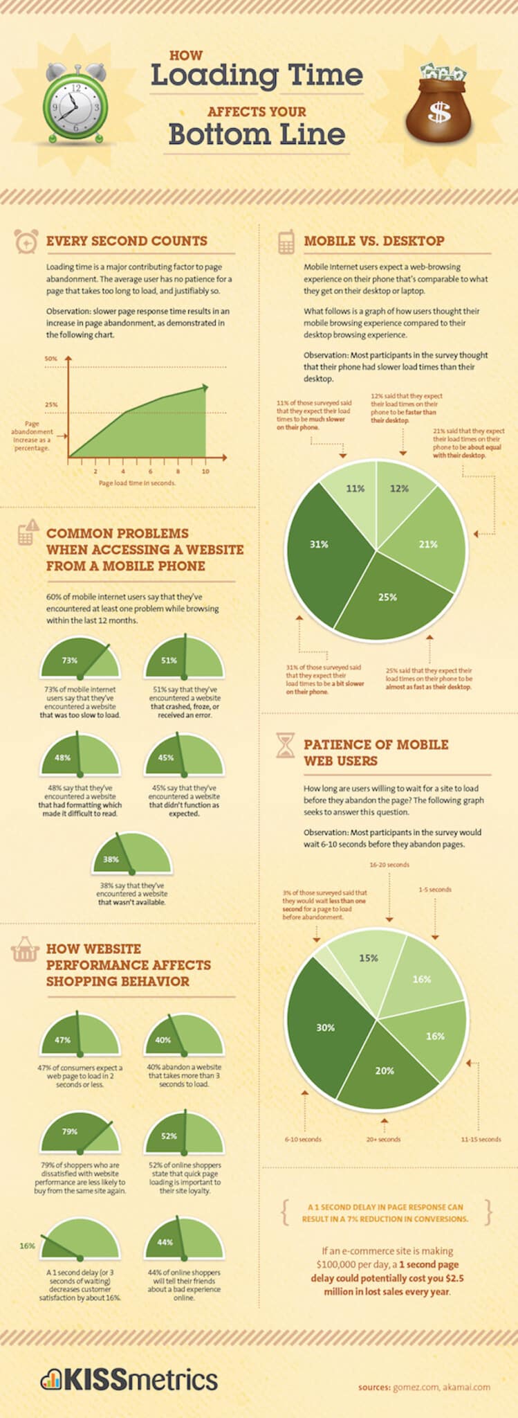
We know. You spent a lot of time and money on that amazing site. If customers have to wait an extra fifteen seconds for everything to load, it’s worth the time, right? Nope. Believe it or not, nearly 35% of web users will abandon a site if it takes longer than ten seconds to load.
See, we’ve become a society of immediate gratification, and the latest technology just spoils us further. If your websites take too long to load, you’re probably either using outdated technology or going about your design and development all wrong. You can test your page speeds with YSlow or Page Speed, but there may be a few things you can do before you even get that far.
Make sure any images you use are resized before you upload them. This goes for everything, from your logo to any design elements. They should also be the right format for the type. For instance, only images that must be of the highest quality—such as your logo—should be the high-quality PNG. Photos and graphics may be just fine in JPG. Of course, this is just the start. You should examine all areas of your website to make sure they load as quickly as possible or no one will be there to drink champagne at your party.
Mobile Device Optimization
Consumers are a bit more patient when it comes to loading times on mobile devices, but you still don’t want to leave them hanging too long. You get between twenty and thirty seconds before people will start bailing. A full site just doesn’t load that quickly on a mobile device, no matter how simple and streamlined your website may be. That’s why you need mobile responsive design.
Aside from the loading times, there are other reasons to use responsive design. If you’ve ever seen a full site on your tiny phone screen, you know they’re hard to read. Responsive design resizes the text so visitors can easily see your message. Will people hang around if they constantly have to zoom in to get information?
Responsive design also leaves plenty of white space around links, so no one will have any trouble navigating your site. Product and service images will be larger, so people can make purchases with confidence. Do you want to take the chance that they’ll come back to your site once they’re near their laptop or desktop? No? Then responsive design is the way to go.
Clear Value Proposition
Have you ever visited a website and wondered what, exactly, the company claimed to do? If so, you probably didn’t hang around long. It’s because the value proposition wasn’t immediately clear. If you don’t want the same thing to happen to you, make sure you let visitors know exactly what you’re all about on the homepage of your site.
You don’t have to spell it out in so many words, either. As long as the message is clear, you’re golden. Take a look at some of the examples below. You’ll see what we mean.
ModCloth
Plan Left
The Dog Spot
Easy Navigation
If someone lands on your website and doesn’t immediately see the links or menu items he or she needs, they might just bounce. Make sure the buttons across the top and left side of the screen show everything. No need to make your whole site a game of hide-and-seek for buyers, right? They won’t think it’s fun.
Also, links should be obvious in some way, whether through underlined text or images that light up, change in size, or change colors. Never leave your buyers hanging, because they’ll go to a competitor with a better website. Every time.
Amazing Content
Your buyers need to recognize you immediately. After your value proposition, the voice you use in your content is the second-most-important factor. If you’ve built a brand around light and fun, don’t scare visitors away with dour content. Conversely, don’t get too silly if you rely on an executive-level clientele.
Beyond your voice, you must also pay close attention to spelling and grammar. Visitors are likely to forgive a typo here and there, but if they keep running into mistakes, their estimation of your professionalism will drop. After one too many misspelled words, they’ll run screaming to your competition.
And now you’re ready to pop the cork on that champagne. All your guests will hang around and give you a reason to celebrate. If you have any questions, invite Plan Left to the party. We can help you with those website design and development issues, go over a content strategy with you, and even help you present the most awesome value proposition on the internet.
Explore Latest Posts
The 80/20 Rule for Marketing: Identifying Your Most Profitable Channels Most marketing budgets are spread too thin across too many ... read more
March 11, 2026
Red Flags When Hiring Marketing Help Hiring the wrong marketing partner wastes money, delays growth, and creates problems that take ... read more
March 4, 2026
From Feast-or-Famine to Predictable Revenue: Creating Consistency in Lead Generation The revenue roller coaster is exhausting. Some months your pipeline ... read more
February 25, 2026
Essential Strategies for Entrepreneurs
Get Actionable Business Insights & Marketing Tips
Our newsletter delivers real-world strategies from entrepreneurs who’ve been exactly where you are.
Sign up now for:
- Actionable growth strategies that work
- Insider tactics for attracting top talent
- Real-world case studies from successful founders
- Emerging tech trends that drive innovation
- Pragmatic marketing approaches for visionary leaders
