You only get one chance to draw a potential customer in with your design choices. Whether reactions are subconscious or not, the fonts you use will immediately engage a viewer with a warming welcome or scare them away. The same is true for print or web design. So many options are out there, each more decorative than the last. Some may head straight for the most flowery of the bunch, but that’s not what results in a professional, clean, and easy-to-read design. You can still find unique and powerful fonts without going overboard.
When pairing fonts, you want the two fonts to speak the same language but still contrast each other. You can play it safe by pairing a serif with sans serif, but this is by no means a concrete rule. Remember that fonts can portray feelings and emotions. Choose something that is appropriate and fits the voice of your business. And always keep in mind that less is more. Don’t fall for trendy, decorative fonts. They will look amateur. Keep it classic.

Josefin Slab is a slab serif with a little more class. With tall ascenders, it is sophisticated but still casual. Pair it with the geometric, sans serif Roboto. Roboto’s friendly curves are great for both headlines and long bodies of copy.

Bitter is a bold, contemporary slab serif that was designed for comfortable reading on screen. The thin, elegant letterforms of Lato complement it well. The Lato family consists of multiple weights, making it versatile. This pair is great for organizing information and establishing clear hierarchy.

Playfair Display is a rich, beautiful transitional font. With a large x-height and short descenders, it is great for headlines and titles. The type nerd in me swoons over the ampersand every time I use it. Contrast the dramatic letterforms of Playfair display by pairing it with Droid Sans. Droid Sans is neutral and almost transparent. It allows headlines to stand out and gives the reader ease with body copy.

Oswald is a classic, sans serif. It was designed to fit the pixel grid of digital screens. Combine Oswald with the typewriter-inspired Lekton for a sleek, modern look.

The handwriting font, Meddon, gives your design a personal touch. The swoopy, cursive characters were inspired by an eighteenth century legal document. The simplicity of Open Sans Light compliments Meddon’s graceful letterforms and provides great legibility.

Nunito’s rounded terminals make for a great display font. Use it for headlines and pair it with the slightly thinner san serif Source Sans Pro. This san serif duo is packed with personality and guarantees readability with a modern look.

Nixie One has a typewriter aesthetic, but is more modern. The thin, almost slab serif makes a great pair with Open Sans. Both fonts speak the same geometric language with the classic typography contrast of serif meets sans serif.

Kreon is a sturdy serif with a lot of personality. It is a bit too round and narrow to be considered a slab serif, but it reads with the same authority. Pair it with the softer, cursive letterforms of homemade apple for a more casual, heartfelt design style.

Arvo is bold slab serif designed for both print and web. The family includes Roman, Italic, Roman Bold, Bold Italic, making it versatile for either headlines or body copy. Titillium Web compliments Arvo’s geometric structure and contrasts well with thin letterforms.

Raleway is a beautiful, display sans serif with nine different weights. Add Quattrocento to the mix for a harmony of elegance and strength. Quattrocento’s tiny details make it stunning at larger sizes and its large x-height keep it easy to read at small sizes.

Montserrat is a geometric style sans serif inspired by urban typography found in posters and signs in the city of Buenos Aires between 1925 and 1950. Classic and grandiose, this bold sans serif pairs well with Volkhov’s large, open counters and low-contrast letterforms.
If you love these fonts and the pairings, let us know! I also love to see other designers’ favorites, so please feel free to share
Explore Latest Posts

Marketing Mistakes That Are Killing Your Margins (And How to Fix Them) Most businesses measure marketing success by growth metrics ... read more
May 27, 2026
Balancing Long-Term Brand Building vs. Immediate Lead Generation Marketing budget discussions frequently devolve into debates between brand building and lead ... read more
May 20, 2026
Social Proof That Sells: Getting Testimonials That Actually Convert Prospects Your testimonials page displays a dozen quotes praising your "great ... read more
May 13, 2026


Essential Strategies for Entrepreneurs
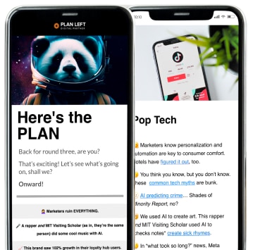
Get Actionable Business Insights & Marketing Tips
Our newsletter delivers real-world strategies from entrepreneurs who’ve been exactly where you are.
Sign up now for:
- Actionable growth strategies that work
- Insider tactics for attracting top talent
- Real-world case studies from successful founders
- Emerging tech trends that drive innovation
- Pragmatic marketing approaches for visionary leaders