As a business developer for Plan Left, part of my role is to have all of the fun conversations with other companies and potential clients. One of the most awkward conversations to have with a company is about their logo. I have come across a wide range of reactions, from
“Yes, I know the logo is bad, but Marcia at the front desk drew it, and she is so proud,”
to
“Our company has had this logo for 45 years! If we changed it, people would…”
or even
“Logos aren’t in the budget!”
Every reaction is disturbing in its own way, but the last one is especially startling. My concern with the last response is, if changing or improving your logo isn’t in the budget, then “looking good” isn’t in the budget either.
You absolutely cannot underestimate the importance of a logo. It is the symbol of your brand. The people, places, times, and services can all change, but the core remains the same. A good logo is visually recognizable, inspires trust, and appears everywhere, so you better like it.
Your logo should tell your audience everything before you even speak.
Points to Consider:
- What qualities are important to your clientele? What qualities can you incorporate?
- Does it look professional? Does it make your company look professional?
- What are your favorite logos? Why do you like them?
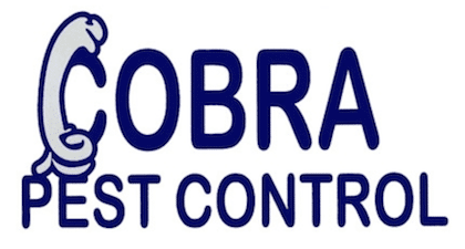
To illustrate this, let’s look at some of the worst logos I’ve ever seen.
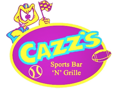
This is a fair attempt, but the blinding colors aren’t friendly at all. And speaking of unfriendly, the mascot, whatever he is, doesn’t look too welcoming, either. In fact, he looks a bit sinister.
Again, the concept isn’t bad, but the execution left a lot to be desired. With help from a professional graphic designer, this logo could really come to life.

The comic sans font should never be used in a logo. That is all. Well, that’s not all. There’s a lot more going on here than just the font, but we can start with that.
![]()
Don’t worry. This looks totally safe.
To the Point
You have to expand your perspective and look at your logo and brand as your audience sees it. Start asking your co-workers, employees, clients, friends, and family what they think of your logo. Don’t get too upset if one or two just don’t seem to get it. However, if more than a few people tell you they don’t like it, say thank you for their honest answers, and consider that a consensus. Or you can always send us your logo, and we will look at it for you.
Either way, the biggest point to address here is that a logo is your company’s “face” and “first impression.” There’s no better way to get attention than to be attractive, and there’s no better way to resolve this attractiveness than through a great logo.
So, how’s your logo?
Explore Latest Posts

Google says the quality of your webpage is a ranking factor, but what is ‘quality’ according to Google? That would ... read more
April 19, 2024
In 2011, Google first changed how content was written with the Panda Update by changing how keywords could be used ... read more
April 17, 2024
The latest Google algorithm changes have shaken the search marketing world. While the Google Spam update has finished, the Google ... read more
April 16, 2024
MARKETING insights
Join the Thousands Who Receive Our Twice-Monthly Newsletter.
It's hard to keep up. Our newsletter is packed with buyer behavior insights, the latest marketing and technology updates, work/life balance tips, and—because we ❤️ our support staff—adorable pets looking for forever homes. Only twice per month. No clogged inboxes. You can't say no.