We’re all fortunate that the days of build-your-own sites through Geocities are behind us. Illegible yellow text and bright red backgrounds are still burned into our retinas, but we’re moving on. Unfortunately, some still long for the days of the bold and the bright, however painful the experience may be for their customers. If you’re designing a new website, the fonts you choose are important. The colors, styles, and sizes give the first impression, whether buyers realize it or not. Good typography invites them to stay on the page and read the content. Poor typography makes reading feel like a chore.
Even those without design experience know when a design doesn’t “feel” right, but they don’t know why. Often this is because they have made poor font choices without realizing it. A good website designer will help you choose fonts, colors, and sizes that make the reading process easy for any of your users. You can always trust a good designer to make the right choices, but this guide will help you understand those choices and make suggestions of your own.
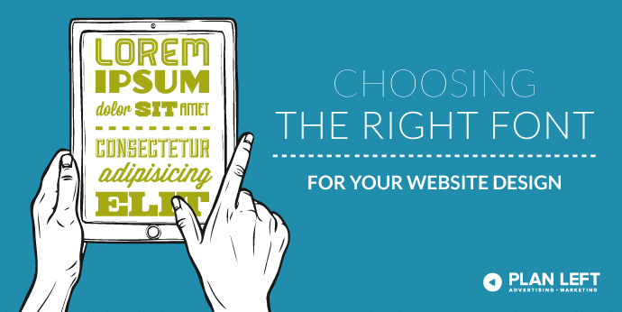
Choosing the Font
The big choice between fonts really falls into two categories: serif and sans serif. Serifs are little lines, flags, or dots at the top or bottom of the letters that add some decoration and, in some cases, better readability. Serifs originated in the days when type was carved into stone. The little feet were placed at the bottom to make the type more legible. The serifs were believed to make the type more readable, as they guide your eye along the baseline. This also gives serif fonts a stigma of being more traditional or formal.
Sans serif (or “without” serif) is a font without those little decorative doohickeys. Sans serif fonts also have less stress, or contrast in thin/thickness, in the lines. This means many sans serif fonts have a “quieter” personality, which pairs well if the rest of your visual branding is bold. You don’t want your font choice to overwhelm the reader or they won’t want to read what it actually says.
Recent tests show that online reading isn’t really affected by serif and sans serif fonts. Speed of reading is negligibly higher with the sans serif crowd, while serif fonts edge out sans serif in comprehension. That probably doesn’t help you much, but this might: People complain about serif fonts. This could be due to vision problems or learning disabilities, but the reason doesn’t matter. The outcome is what you should be concerned about.
Choosing the Size
Recommended font sizes change according to the device used for reading said fonts. For instance, desktop and laptop computers should have no more than 75 characters per line at a 16-point font size. If you use a smaller size to cram more words in, your users will have a hard time reading.
For mobile friendly design, you should use no more than 40 characters for each line. The real key here is “mobile friendly,” too. If you try to pass your full site off on mobile devices, the print will be entirely too small. Rather than spending time zooming to read, your customers will probably just go somewhere else.
Choosing the Color
Believe it or not, black isn’t always best. It’s definitely better than the yellow-on-red scenario, but it still might cause some strain on buyers’ eyes. Many designers now suggest that gray tones—the darker the better—work wonders on website designs. Users find the softer colors on a soft background lead to longer reading periods.
When choosing colors that are mobile friendly, be sure to test them on your own device before sending them out into the world. The glare present when you take phones and tablets outside make the gray fonts harder to read. You may need to try several different options before choosing the best.
The point of any website design is to create a great experience for your users. You want those buyers to accomplish their goals. That means you may need to be flexible with your idea of your dream website design and roll with different fonts, colors, and sizes. If your users can do what they need to while on your website, the outcome is worth your sacrifice, right?
If you’re considering a new website or a redesign, come talk to us. Even mediocre typography can be strengthened. The fonts you choose may seem like a small detail but it makes a huge impact. Let us explain in person why that bright pink background and baby blue text just won’t fly.
Explore Latest Posts

Google says the quality of your webpage is a ranking factor, but what is ‘quality’ according to Google? That would ... read more
April 19, 2024
In 2011, Google first changed how content was written with the Panda Update by changing how keywords could be used ... read more
April 17, 2024
The latest Google algorithm changes have shaken the search marketing world. While the Google Spam update has finished, the Google ... read more
April 16, 2024


MARKETING insights
Join the Thousands Who Receive Our Twice-Monthly Newsletter.
It's hard to keep up. Our newsletter is packed with buyer behavior insights, the latest marketing and technology updates, work/life balance tips, and—because we ❤️ our support staff—adorable pets looking for forever homes. Only twice per month. No clogged inboxes. You can't say no.