

Hello! Are you reading this on a mobile device or on a laptop?
According to the latest research, there’s a pretty good chance you’re on a mobile device.
In fact, recent stats show that the majority of internet users are now accessing the world wide web on mobile devices.
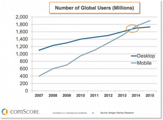
This change has been a long time coming.
And it has influenced search engines, advertisers, marketing specialists, and brands far and wide.
It should be no surprise to learn that Google has, in fact, begun testing a mobile-first evaluation with its algorithms.
This means that your site’s mobile version will be Google’s first stop when evaluating your site’s pages.
It also means that sites’ mobile versions will be used in image snippets and in Google’s studies of structured data.
Of course, this isn’t a be-all, end-all change.
Your previously dominant site isn’t going to fall to page 10 overnight.
If you’ve built your mobile site well (or linked your desktop and mobile sites impeccably), you shouldn’t have to worry.
That being said, there are some important elements of this change that we should all consider.
Consider Your Site’s Method of Mobile-Friendliness
According to Mobilegeddon (Google’s announcement that non-mobile-friendly sites would suffer in results pages), Google’s preferred method for making your desktop site mobile-friendly is responsive design.
-
Responsive design is a site setup that tells your site to always send the same HTML code for the same URL to all devices—and then allows the CSS to alter the way that code renders on each device.
Responsive design provides the most accurate and true-to-form iteration of your site from desktop to mobile devices. However, because it’s tied directly to your site, when the desktop version goes down, so does the mobile version.
-
Dynamic serving is another method of altering your site’s content from desktop to mobile. It changes the HTML and CSS for your site’s URL depending on the device that’s being used to access it.
Dynamic serving makes changes to your site’s rendering so it fits the device that’s accessing it—so not all of the elements and content you include on your main site will carry over.
The way your site’s structured markup differs from desktop to mobile devices is of capital concern with this new Google update.
What does that mean, you ask?
Well, structured markup is simply on-page signals imbedded in the HTML code—a roadmap that provides search engine crawlers with a path for reading and understanding what your site offers.
Search engines use structured markup to figure out what your site offers–so if your website renders with less information and content on mobile, you aren’t necessarily offering your users the best experience or the most value.
And because Google is now looking at your mobile site as the standard, you may also face possible devaluation on Google’s SERPs.
Get your website graded here.
Switch Up Content to Appeal to a Mobile Audience
Reading long-form content on a mobile device is not as easy as it is on desktop.
But that doesn’t mean you can’t offer dynamic content that Google and your users love.
First, consider your industry.
Is the majority of your industry’s audience on mobile or desktop devices? How do they engage with your content? Are you products mostly visual? Do you blog?
Consider these stats from Hitwise, which break down mobile-user activity by industry:
-
72% of online searches in the Food and Beverage industry were initiated on a mobile device
-
68% of online searches in the Health industry were initiated on a mobile device
-
68% of online searches in the Sports industry were initiated on a mobile device
-
64% of online searches in the News and Media industry were initiated on a mobile device
-
62% of online searches in the Lifestyle industry were initiated on a mobile device
-
62% of online searches in the Automotive industry were initiated on a mobile device
-
56% of online searches in the Retail sector were initiated on a mobile device
Of course, this is just a snapshot of mobile activity in a few key industries.
The point? You need to create content and provide information that appeals to your audience across desktop and mobile iterations.
If you’re in an industry where most users are accessing sites using their mobile devices, you should brainstorm on content genres that are more engaging for mobile users.
And the bottom line? Just make sure your site’s mobile version is amazing and that your users love it.
Speaking of which…
Make Sure Your Site’s Mobile Version is Amazing
You have to get your site’s mobile presence in top shape if you want to compete in the new mobile-first landscape.
How do you do that?
-
Make sure any large pictures are sized to fit a mobile user’s screen.
-
Disable interruptive interstitials and ads that force a user to click around them.
-
Increase page load speed for optimal mobile response.
-
Make your site easy to scroll through. Re-order your content so that it is presented in an intuitive and natural way for mobile users.
-
Consider changing text sizes on your most popular pages. Make sure your readers can immediately read headers and page titles so they don’t become bored or disengaged.
If you’re still having trouble creating a truly fantastic mobile website, you aren’t alone.
To address the growing issues with mobile sites, Google’s Developers got to work.
In October of 2015, they introduced AMP, an open-source initiative that aims to help brands’ mobile content look better, react better and perform better.
In just one year, AMP has helped some of the world’s biggest publishers provide a superior mobile experience for users. And they did it without sacrificing those publishers’ ad revenue.
Check out
“>this introductory video on AMP.
We’ll be back with more in-depth information on AMP soon…so stay tuned.
Still have questions? Plan Left can help.
Explore Latest Posts

The latest Google algorithm changes have shaken the search marketing world. While the Google Spam update has finished, the Google ... read more
April 16, 2024
The latest Google Spam update ended 15 days after being rolled out, but the Google Core update is still in ... read more
April 12, 2024
Crafting recipe content that rises to the top of search engine rankings isn’t as simple as putting together a list ... read more
April 9, 2024

MARKETING insights
Join the Thousands Who Receive Our Twice-Monthly Newsletter.
It's hard to keep up. Our newsletter is packed with buyer behavior insights, the latest marketing and technology updates, work/life balance tips, and—because we ❤️ our support staff—adorable pets looking for forever homes. Only twice per month. No clogged inboxes. You can't say no.