It’s interesting how often just a subtle change in the tone of a color will make all the difference in the world for an onlooker. In speaking about what a person is looking for in a color palette, usually it’s not determined by the client but the consultant as to what colors will work best to bring out what the brand is really trying to represent.

This pretty much goes for any application – website, storefront, logo, ads, etc.
Color palettes can be determined by a wide variety of things. It’s true that designers often have a color palette, they tend to stick with what they like. A good designer will help determine and establish a color palette for a client that is tailored to them and their needs. As a person potentially looking for colors that will work best for your business or endeavor, how can you know what to look for, or what will work for your brand?
Ask yourself these questions:
- What am selling, and who am I selling it to? Whether an artist, or an electric vehicle charger distributor, everyone has something to sell.
- Who’s your audience?
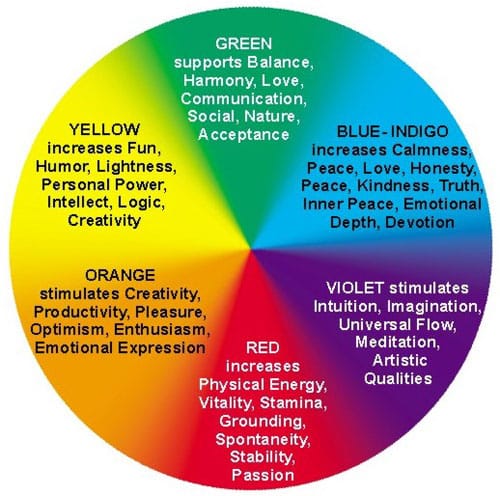
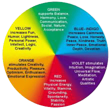
- What is the user experience I want people to have? McDonald’s uses mainly yellow and red to entice visitors to order fast, eat fast, and leave the restaurant fast. It works because they’re fast food, obviously. But a restaurant that’s looking to keep people around would want blue tones and greens – colors that make people feel comfortable and relaxed.
For those interested in the psychology of color use, there are articles out there like this one. Sometimes hard lines created by complementary colors can be disturbing for a person to look at, but often it’s a good way to create distinctions and definitions of space and associate meaning.
The best advice I can give for choosing a good color palette is to pay attention, to not be afraid of using colors that are vibrant, but be aware when colors or objects are distracting or make things hard to understand. It’s easy to make things so bland that there isn’t enough contrast, but it’s also easy to offer so much contrast that it becomes confusing. Try getting a second opinion, or even a third, but always from trusted resources, and be sure that whatever you choose, the decision is ultimately one that you agree with.
Explore Latest Posts

Google says the quality of your webpage is a ranking factor, but what is ‘quality’ according to Google? That would ... read more
April 19, 2024
In 2011, Google first changed how content was written with the Panda Update by changing how keywords could be used ... read more
April 17, 2024
The latest Google algorithm changes have shaken the search marketing world. While the Google Spam update has finished, the Google ... read more
April 16, 2024


MARKETING insights
Join the Thousands Who Receive Our Twice-Monthly Newsletter.
It's hard to keep up. Our newsletter is packed with buyer behavior insights, the latest marketing and technology updates, work/life balance tips, and—because we ❤️ our support staff—adorable pets looking for forever homes. Only twice per month. No clogged inboxes. You can't say no.