It’s sometimes hard to know how much SEO value an image can really have… You can tag it, title it, meta title it, alt title it, give it a Dublin Core title (and all the various iterations therein). But what else plays a role here, and how can images help your website further than this?
The initial design of a website should always be considerate of 1) what you want a user to do, 2) the feeling you want them to have, 3) the interface on which a design is being applied, and 4) the ways in which all these elements will speak to each other. These all need to be looked at to make sure that they do not conflict with any other moving pieces and that all the goals are attained. The best implementation of these elements can help to set your site up for SEO success.
What do you want the user to do?
If your website is hard to use, you’ll have trouble keeping viewers on the page. However, if everything is laid out in a manner that makes navigation easy, suggests areas of interest, and “leads” the user to areas you want them to go, you’ll keep visitors there for longer periods of time.
A proper user interface, or layout / theme, will help to keep people on the site, and will help to communicate to users whatever it is you want them to do. This helps SEO in two ways: 1) The longer people stay on your site the higher traffic value you have, and 2) if the user found your website for one term and then navigates to more interior webpages on your site, you will begin to show up higher in search results for other terms relevant to those interior webpages.
What do you want your user to feel?
Another good way to reach your user (and keep them on the site!) is to apply colors and images. Even typography will encourage certain feelings of interest or direction. Blue, for example, can help a person feel relaxed. We help our clients in this way from the beginning by establishing colors that associate certain feelings to their audience. We establish a standard color palette to have a consistent feeling throughout everything from their logo, digital ads, web design, and on. By using this same color palette we can gain similar reactions throughout all their branded properties.
Some people don’t put any thought how typography affects the emotions of the user when in reality a font is how visitors are reading information about you and your website. A serif font (Times New Roman, for example) can create a very distinguished and almost “proper” brand image. If you choose a sans-serif font though (Arial, Helvetica), the lack of curvature won’t necessarily be more relaxed, it’s can just be easier to read, or can create a very “Contemporary” or “Modern” look for a graphic / logo. Designers and developers will often choose a sans-serif font for the Body of the pages (where most of text lives on the site) to make viewing and experiencing the site a little easier. However, if you’re a publication, an attorney, or corporation looking to be taken with a more serious tone, a serif or Times-like font will be more to your liking most likely and convey the desired tone.
Pay attention to the details. Establishing a color palette and typography guidelines that will best represent you is crucial to communicating your message to viewers and users of your brand. Your website will benefit from this proper understanding by making your website easy to read, clear to understand, and helpful to the visitors!
Explore Latest Posts

Google says the quality of your webpage is a ranking factor, but what is ‘quality’ according to Google? That would ... read more
April 19, 2024
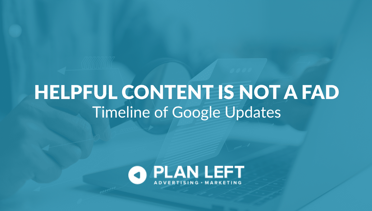
In 2011, Google first changed how content was written with the Panda Update by changing how keywords could be used ... read more
April 17, 2024
The latest Google algorithm changes have shaken the search marketing world. While the Google Spam update has finished, the Google ... read more
April 16, 2024

MARKETING insights
Join the Thousands Who Receive Our Twice-Monthly Newsletter.
It's hard to keep up. Our newsletter is packed with buyer behavior insights, the latest marketing and technology updates, work/life balance tips, and—because we ❤️ our support staff—adorable pets looking for forever homes. Only twice per month. No clogged inboxes. You can't say no.