In April, Google threw down a daunting—yet mobile-friendly—gauntlet at the feet of digital marketers and developers worldwide. Google challenged the entire internet to either become mobile-friendly or suffer the consequences of lower rankings.
We’ll take a pragmatic look at these new mobile-friendly guidelines, and we’ll also review some that we predict Google will focus on in the future.
THE NUTS AND BOLTS OF MOBILEGEDDON
Here’s what’s on Google’s current mobile-friendly checklist:
1) Your website’s text size. The text on your website needs to be readable on mobile devices!
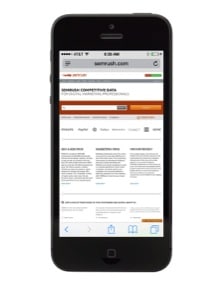
Example: We’re big fans of SEMRush here at Plan Left, which is why it makes us very sad that the text on its website is too small to read on our mobile phones. Can you read what’s on their home page below? We can’t either!
2) Your website’s content. The content on your website needs to be sized to a mobile screen when viewed on a mobile device.
Example: TheHairpin.com is an eclectic mix of essays, advice, and entertainment news which cannot, unfortunately, be enjoyed on a mobile phone:
3) Your website’s links. The links on your site must be a reasonable distance apart. We’re all thumbs when it comes to typing on our mobile devices, so having links an appropriate distance from each other is necessary. (Note: have you noticed that numbers one through three are variations on a theme? Google wants websites visited via mobile devices to be useable.)
Example: W. W. Norton is one of my favorite publishers, so I’m disappointed that their site isn’t mobile-friendly. When I visited it on my mobile phone, I found it very difficult, if not impossible, to click on the individual book categories found on the left of their home page:
(Note: for all you internet-savvy folk, I highly recommend W. W. Norton’s The Shallows: What the Internet Is Doing to Our Brains by Nicholas Carr. It was a finalist for a Pulitzer Prize in 2011, and it will push you toward a more meaningful digital existence.)
4) Flash. If you’re still using Flash on your website, you need to stop. Why? Many mobile phones don’t support Flash.
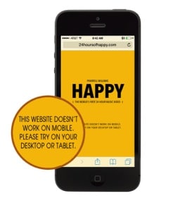
Example: Want to check out the 24-hour music video Pharrell Williams created for “Happy” while you’re camped out in line at the DMV in the hopes it’ll put you in a better mood? Too bad! You can’t; its website is built in Flash.
GOOGLE’S MOBILE UPDATES OF THE FUTURE
We like to plan for the future at Plan Left, so we’ve compiled a list of mobile site issues we believe Google will address in the next few waves of mobile updates. Like the issues on Google’s present mobile-friendly checklist, we’ve focused on usability:
1) In order to create a true device-agnostic experience, your mobile site should offer the same options as its desktop version. Google is now quite adept at understanding cross-platform user behavior, so it makes sense that Google could begin to monitor cross-platform consistency. In fact, Google warns us to “please be cautious about creating a ‘stripped down’ [mobile] version of your site.”
Example: There’s no way to make a reservation for a disabled person on Megabus’s mobile website, which is something you can on their desktop site.
2) Your mobile website must have an appropriate text size. Google already pays attention to text size on mobile sites, of course, but we predict they’ll focus more closely on it in the future.
Example: Even though FlexJobs.com is deemed mobile-friendly by Google, its text can hardly be read on a mobile device. It’s too small to be truly mobile-friendly.
3) Your mobile site’s title and your desktop site’s title should match. If the name of your website doesn’t match the name of your business, people are less likely to trust your brand. Google has long been known to reward the trust and quality that come with brand authority, and we predict that this will soon be applied to brands’ mobile sites.
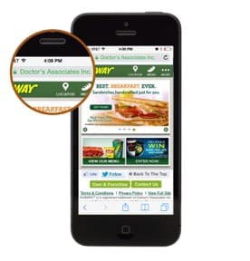
Example: Would you believe that the building you just entered housed a SUBWAY if the sign on the building read “Doctor’s Associates Inc.”? I wouldn’t. Yet the title of SUBWAY’s mobile site is “Doctor’s Associates Inc.”
4) The placement of ads on a mobile site must not hinder user experience. Three years ago, Google decided to penalize websites that had thin content and multiple ads above-the-fold. We believe this Page Layout Algorithmic Improvement will be carried over to mobile sites in the near future.
Example: When you visit TheArtofManliness.com on your mobile device, the only thing you see is an ad:
THE BOTTOM LINE
We don’t have a crystal ball and no certified psychics work here, so we can’t say for sure what the future holds. If we learn from history, however, we know that Google never stops updating their algorithms, all in the name of giving users the best possible experiences. We can be reasonably certain that the suggested changes above will some day be required. If you want to avoid a future mobilegeddon, you could go ahead and make those changes now. You’re already sprucing up your site to meet the current requirements, so why not go the extra mile and save yourself heartache later?
Do you want to know if you have a mobile-friendly website? Google’s provided a way for you to easily check.
Do you still have questions? Let us know! We’re here to help.
Explore Latest Posts
In 2011, Google first changed how content was written with the Panda Update by changing how keywords could be used ... read more
April 17, 2024
The latest Google algorithm changes have shaken the search marketing world. While the Google Spam update has finished, the Google ... read more
April 16, 2024
The latest Google Spam update ended 15 days after being rolled out, but the Google Core update is still in ... read more
April 12, 2024
MARKETING insights
Join the Thousands Who Receive Our Twice-Monthly Newsletter.
It's hard to keep up. Our newsletter is packed with buyer behavior insights, the latest marketing and technology updates, work/life balance tips, and—because we ❤️ our support staff—adorable pets looking for forever homes. Only twice per month. No clogged inboxes. You can't say no.
