Your conversion rates are an indicator of the success of your marketing, the efficiency of your design and the relevance of your message.
If your pages and offers aren’t converting, it’s clear that you aren’t giving your audience what they want.
Or at least you aren’t packaging it in a way that speaks to them.
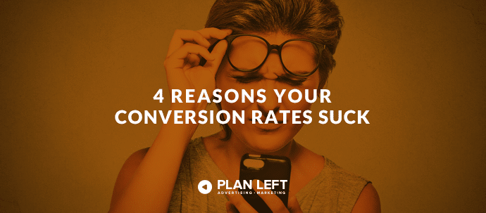
Check out these four big reasons your conversion rates leave a lot to be desired.
Your Calls-to-Action Are Uninspired
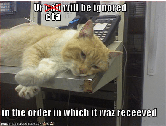
When it comes to conversions, your CTAs are your bread and butter.
Anytime you’ve downloaded a free offer, signed up for a mailing list, or redeemed a free trial, you’ve done so (at least in part) because of a call-to-action that prompted you.
So when your CTAs become lackluster, badly designed or don’t have a clear command, your conversions naturally diminish.
Here are some key ways that CTAs fail:
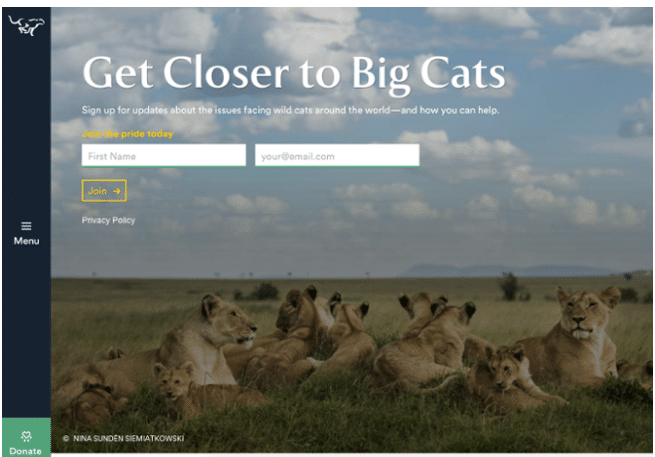
They aren’t specific enough. When your CTA offers something vague (especially when your surrounding text is weak), don’t expect your visitors to convert. “Learn More” isn’t attractive on its own. “Get It Now” isn’t compelling if your surrounding design doesn’t prepare your reader. “Download Free Demo” or “Try Free Tutorial” are more specific, telling your visitor exactly what they can expect and will receive.
Too much design. If your CTA overloads your viewer with color, words, and actions, you can’t expect them to know what you’re offering, let alone whether they want it or not.
They don’t deliver what is promised. If you try to fool your viewers with an amazing, titillating offer and don’t deliver during the next step, you have no one to blame but yourself when your conversions sit at 0%. Make sure your offer matches the promise of your CTA.
They blend in. On the opposite side of the over-design coin lies being too inconspicuous. If your reader can’t discern where your CTA is on your page, don’t expect them to click and explore further. Design that stands out, titillates and inspires curiosity is a must.
Your Offer is a Bad Fit
Deciding which content or offer to attach to a CTA is a tough process.
You have to use a number of insights to determine this.
First, consider the page your visitor is accessing.
Is it your products page? Then he or she is likely more brand-aware and ready to convert on a product-related offer than someone who is arriving on a blog post or your About Us page.
A CTA for your latest webinar might not be the best fit for your blog page.
Similarly, you don’t want to offer a discount for your latest product on your About Us page.
Consider where your visitors are in the buying cycle. Cater the offers you choose and the CTAs you design to your visitors’ level of brand awareness and the offer they’re most likely to engage with.
You Aren’t Speaking Your Audience’s Language
You have to show that you’re an industry insider and are attuned to the needs of your audience.
Standard language and vague, boilerplate promises make you look like an outsider, an inaccessible corporation who doesn’t know anything about your customers.
Incorporate language that lets your potential leads know you’re a part of their universe.
For example: imagine you’re an organic skincare company, and your offer is a detailed list of companies who use all-clean ingredients in their products.
Your landing page should incorporate language that your customers understand, and that signals you as an industry insider and consummate professional
Instead of just “Download Now,” consider language like “Get Insight Into Today’s Top Organic Retailers.”
Be specific, speak to their needs, and speak their language.
You’ve Got Too Many Distractions
Does your landing page include the main navigation?
Do you have links to blogs, other products or social media follow buttons?
Get rid of them now. Extra stuff won’t make your landing pages better or more useful.
It makes them more distracting, more scattered, and less likely to convert.
And even though you want people to read your blog and follow your brand on social, you don’t want to sacrifice a lead who’s ready to convert in order to make it happen.
Make your landing pages and CTAs as free of distractions as possible.
Remove your site’s main navigation, and don’t include a blogroll widget at the bottom, even if a blogroll is available on every other page of your site.
Remove social sharing icons and hashtags, too.
A streamlined approach will help your potential leads remained focused on converting on your offer, providing you with the engagement you need to move the relationship forward.
Still have questions about conversions, CTAs and landing pages? Plan Left can help.
Explore Latest Posts

Google says the quality of your webpage is a ranking factor, but what is ‘quality’ according to Google? That would ... read more
April 19, 2024
In 2011, Google first changed how content was written with the Panda Update by changing how keywords could be used ... read more
April 17, 2024
The latest Google algorithm changes have shaken the search marketing world. While the Google Spam update has finished, the Google ... read more
April 16, 2024
MARKETING insights
Join the Thousands Who Receive Our Twice-Monthly Newsletter.
It's hard to keep up. Our newsletter is packed with buyer behavior insights, the latest marketing and technology updates, work/life balance tips, and—because we ❤️ our support staff—adorable pets looking for forever homes. Only twice per month. No clogged inboxes. You can't say no.